Intro
As a Visual Designer at Lenme, I led the creation of illustration systems across the app and key interfaces. My goal was to craft purposeful, visually engaging illustrations that align with Lenme’s brand—improving usability, building trust, and driving engagement.
Previous Illustrations
The first iteration of the raindrop character (v1.0) struggled to convey emotion and dynamic posture. It also imposed limits on background color usage, and its overly cute tone didn’t reflect Lenme’s core values of trustworthiness and reliability.
Static expressions made it hard to convey nuanced states (confidence, caution, success).
The playful, cute style diluted signals of credibility and reliability.
Character rendering forced a narrow palette, limiting composition and accessibility contrast.

Competitive Analysis
Apps reviewed across the App Store and Google Play to inform Lenme’s illustration strategy.
Robinhood
Brand-forward vector style; illustrations educate without heavy text.
- Concept explainers
- Trust-building visuals
Credit Karma
Friendly characters humanize finance; color signals status states.
- Personable brand tone
- Status & progress cues
Venmo
Playful spot-illustrations; supports lightweight education and delight.
- Moments of delight
- Social context cues
NerdWallet
Clean, vector-based illustrations that simplify complex personal finance concepts.
- Guides financial literacy
- Approachable, trustworthy visuals
Chase
Minimalist, polished brand visuals; illustrations reinforce credibility and security.
- Professional, conservative design
- Focus on clarity & trust
Key Takeaways
- Illustrations reinforce brand identity and trust.
- Friendly visuals simplify complex financial concepts.
- Most top apps minimize logout friction in side menus.
- Consistency in visual language improves usability.
Illustration Goals
Build a Strong Brand
Create illustrations that connect with users and signal trust. Visuals should reinforce Lenme’s reliability and brand identity.
Improve User Experience
Use engaging visuals to capture attention and increase satisfaction. Well-designed illustrations make the product feel enjoyable and encourage continued use.
Purposeful Integration
Every illustration should have a clear job—guide, clarify, or support messaging. No filler; only meaningful visuals that improve usability.
Key Observations
Leading companies like Credit Karma, Chase Pay, and Robinhood leverage illustrations as a core communication tool.
-
Brand Strength
Strategic illustrations strengthen recognition and trust.
-
Clarity
Well-crafted visuals simplify complex concepts into clear, digestible insights.
-
Guidance
Purposeful illustration directs users toward key actions and decisions.

The Sketches
After conducting comprehensive research and analysis, I proceeded to create initial sketches as a result of my findings. To kickstart the design process, I began with quick and rough sketches, exploring different possibilities and concepts.
Based on these initial sketches, I generated three distinct styles, each with its own unique attributes and characteristics. After careful evaluation and consideration, I made the decision to proceed with the second style, as it struck the perfect balance of detail and simplicity.
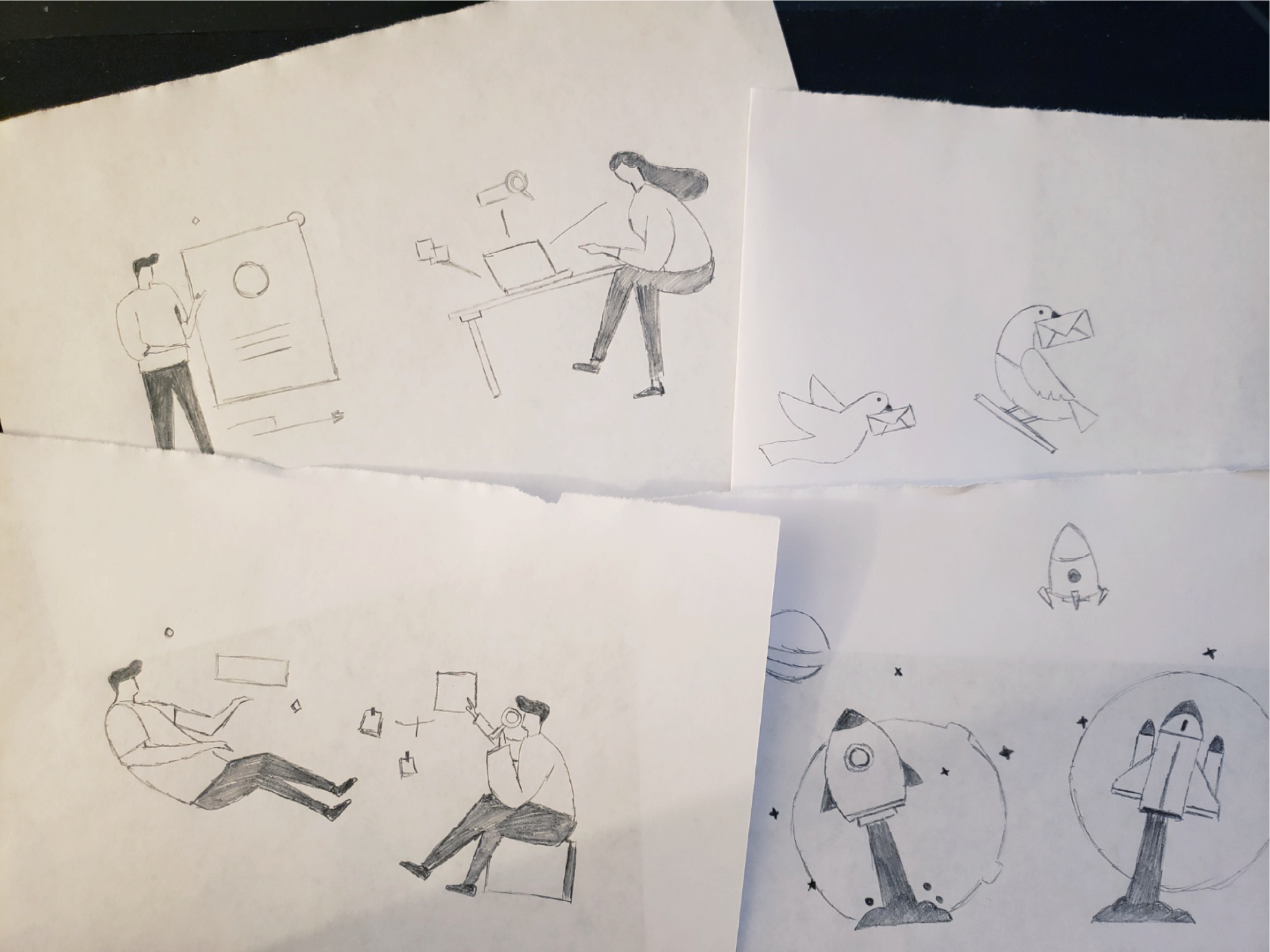
At this point, I had a clear idea of the style I wanted and began creating different designs within that chosen style. It was important to find a balance between creativity and practicality, considering that more adjustments and refinements would be made in the Illustrator phase.
During this creative stage, I purposefully kept the designs free from excessive details. My focus was on capturing the overall essence and composition, leaving room for flexibility and adjustments when working with Illustrator later on. This approach allowed for a more fluid and adaptable process, ensuring that the designs could be easily refined and modified as needed.

After importing the hand sketches into Illustrator, I digitally transformed them into refined sketches. Using the software's tools and features, I carefully recreated the initial concepts, ensuring their precision and polish.
Within Illustrator, I developed into different thematic directions, generating multiple options for consideration. Through a thoughtful evaluation process, I narrowed down the choices to determine the most outstanding and appropriate option. This process ensured that the final design harmonized seamlessly with Lenme's goals and visual identity.
Final version
The illustrations used in the Lenme app are designed to make the user experience more engaging and convey important information in a visually appealing way. They add a touch of creativity and visual interest throughout the app.
The style of the illustrations is modern and clean, with vibrant colors that catch the eye. Consistent design elements, like lines, shapes, and typography, give the illustrations a cohesive look that users can easily recognize.
These illustrations are strategically placed in the app to provide clarity and improve usability. They work alongside buttons, icons, and text to guide users and help them understand how to use different features. For example, they may show the different steps of a process or visually represent data and statistics.


