Redesigning Profile Settings

Role & Project Context
Product Designer (research → UX → UI)
-
Pain points → Decisions
Buried settings and scattered labels were consolidated; navigation labels standardized for quick recognition.
-
Lean validation
Wireframe → prototype → visual pass, validated with lightweight usability checks.
Profile Settings Redesign
Why Redesign?
We addressed key usability issues that affected efficiency and trust:
-
Redundant information
Home content overlapped with other areas, leading to confusion and repeated navigation.
-
Accessibility gaps
Limited support for diverse needs made core tasks harder to complete.
-
Accidental logouts
Primary navigation placed too close to Log out triggered unintended session drops.
-
Visual overload
High-contrast “Switch account” control broke hierarchy and focus.
Solution
By streamlining information display, improving accessibility, preventing accidental logouts, and refining color contrast, the redesign enhances functionality, usability, and overall user experience — aligning the app with modern design best practices.
What is the current experience look like?

Identified Issues
- Accessibility Gaps: Limited features reduce inclusivity for users with diverse needs.
- Accidental Logouts: Poor button placement often disrupts sessions.
- Visual Overload: The “Switch to Borrower (Investor)” button’s high contrast breaks the visual harmony.
Solution
By streamlining information display, enhancing accessibility, minimizing accidental logouts, and optimizing color contrast, we elevate usability and align the app with best design practices.
Competitive Analysis — Side Menu & Navigation
Comparison of popular apps’ navigation and side menu structures.
 Uber
Uber
 Venmo
Venmo
 Lyft
Lyft
 PayPal
Insight: All six apps keep “Log out” inside Settings, not in side menus — preventing mistakes, supporting session continuity, and keeping focus on core actions.

Redesigning the Lenme Settings Page
We re-architected the settings flow to improve findability, clarity, and task completion. The new structure maps the end-to-end journey and surfaces the most used controls first.
What changed
We introduced a clean hierarchy, consolidated scattered options, and aligned labels and icons to platform patterns for faster recognition.
Key outcomes
- Effortless navigation across categories
- Faster option discovery
- Easy preference customization
The result is a clear, intuitive, and user-friendly settings experience that reduces friction and supports confident decisions.

Proposed Design — Panel-Based Profile Settings
A panel layout organizes related settings into clear groups. It keeps the page scannable, reduces cognitive load, and makes frequent tasks faster.
Why panels
- Clarity: Related options live together.
- Hierarchy: Headings, labels, and spacing guide the eye.
- Efficiency: Users find and change settings quickly.
Interaction pattern
- Tabs / Accordions: Move between panels without losing context.
- Progressive disclosure: Show details on demand.
- Personalization: Remember last-opened panel.
- Familiar patterns
- Lower cognitive load
- Faster task completion

Before vs After — Settings Redesign
Before
- Bright gradient background distracts from content
- No hierarchy: all items shown with equal weight
- Low-frequency actions (Logout, FAQ) clutter main menu
- No data visualization, only raw numbers
After
- Minimal white background focuses on content
- Clear hierarchy: Profile → Core → Secondary actions
- Graph & filters for investment performance tracking
- Simplified menu with only essential options

Edit Address
When accessing the “Edit Address” feature, users are presented with a user-friendly interface that prompts them to enter their new address information. The interface includes fields for inputting the street address, city, state, and postal code.
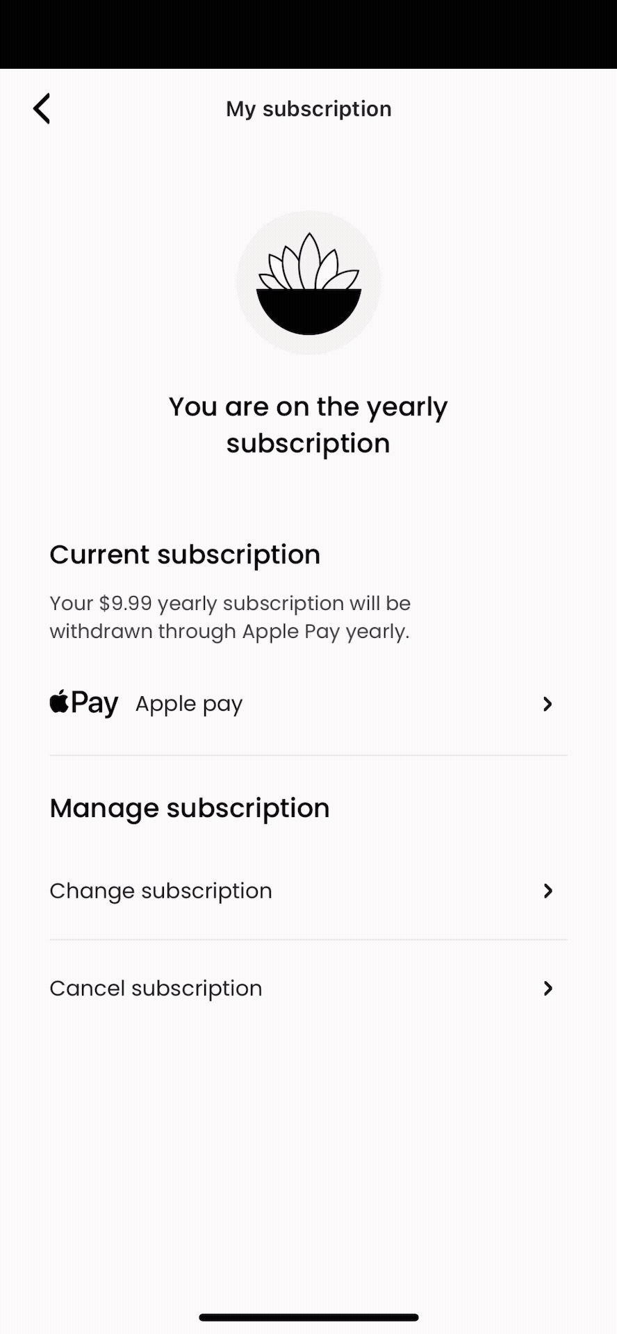
Manage Subscription – Change Subscription
A newly introduced feature gives borrowers more control and flexibility in managing their subscription plans.
Key Improvements
- Effortlessly change or cancel subscription plans
- Switch between monthly or yearly billing in a single tap
- Eliminates dependency on customer support for simple changes
- Designed with clarity and simplicity to reduce friction